Be Bold.
Be Relevant.
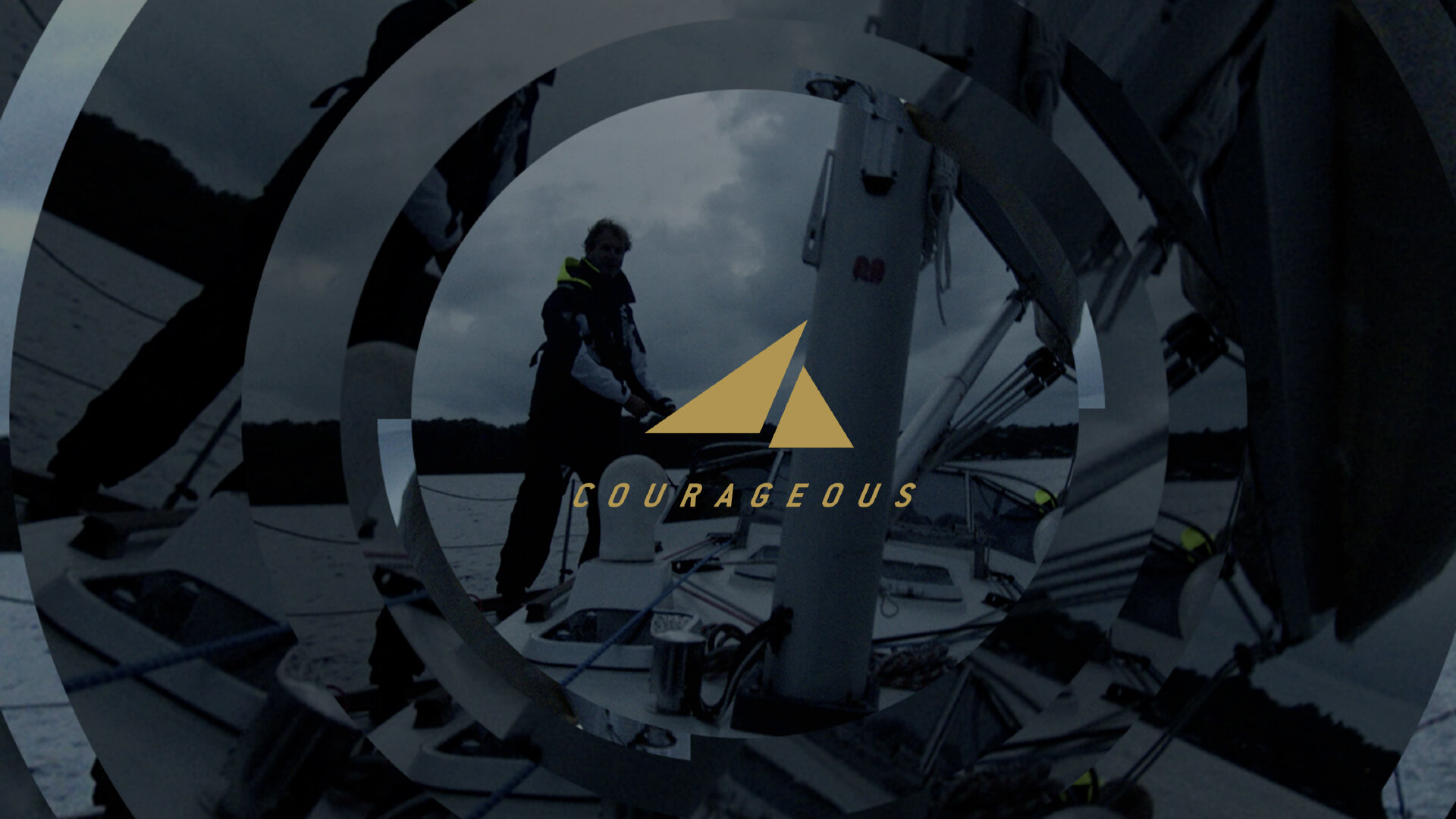
Be Courageous.
2020 Courageous Studios
Art Direction-Brand Identity-Digital Design
Redesign of Courageous studio identity to reflect the studios’ changes and legacy.
The year 2020 marked the fifth anniversary of Courageous Studios and its evolution from a small startup to the best branded-content studio in the nation. This milestone was an ideal opportunity to update the branding to better reflect the studio’s strength and perseverance. As a brand ambassador, it was my duty to maintain the brand’s equity by delivering a cohesive brand language, responsive logo suite, and materials that visually elevated the studio. All internal collateral—from presentation, pitch decks, case studies, and magazine to production binders—better conveyed the message of Courageous internally and to prospective clients: Be Bold. Be Relevant. Be Courageous.

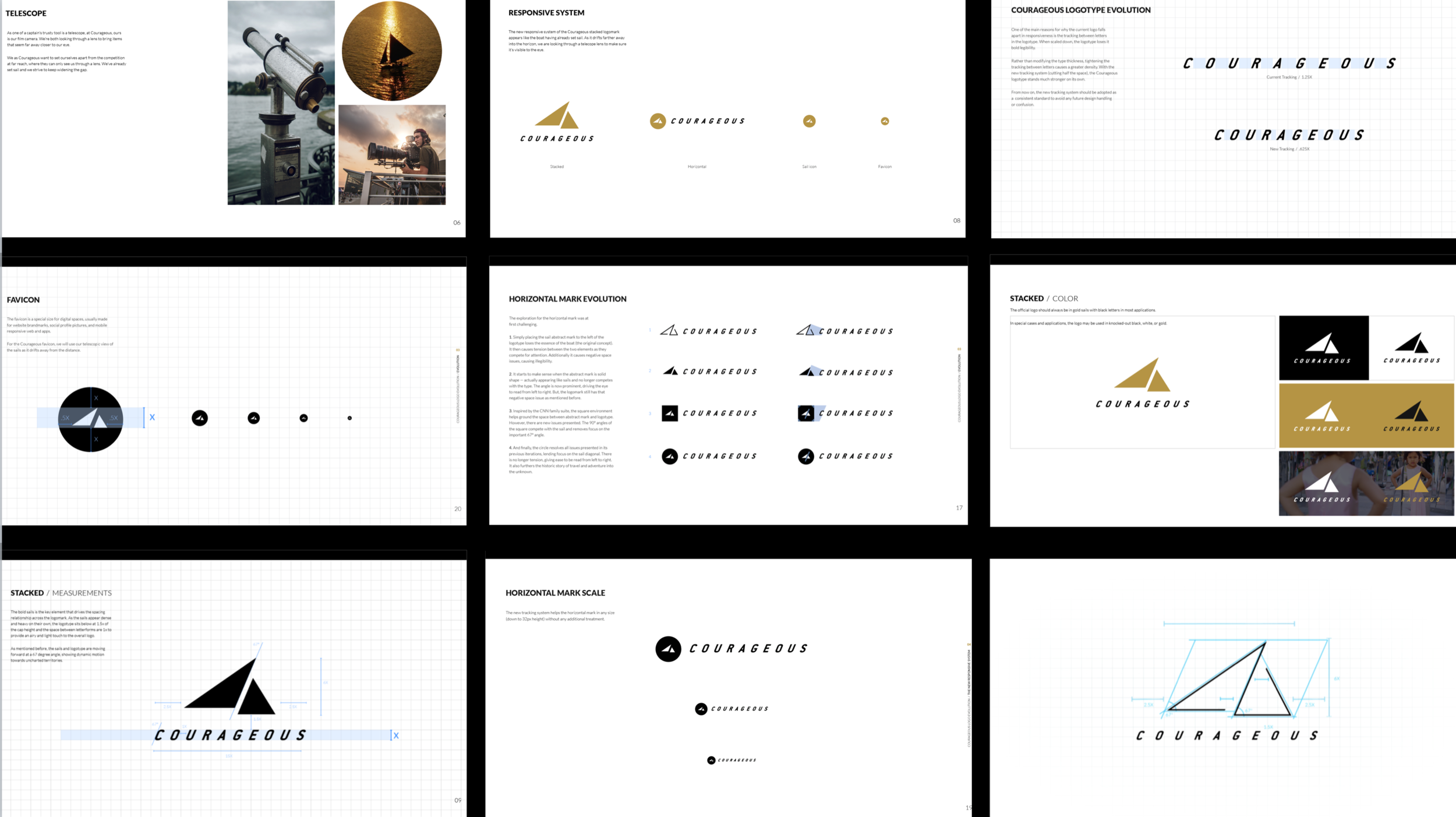
current state. With its fine lines. When scaled down, the logotype loses its bold legibility.. Before modifying the logo, we need to breakdown the current logo and showcase the reasons why it works at this size. understand the history and how to maintain integrity, essence, and elegance. Understand the anatomy of the current Courageous logo. The namesake of CNN’s branded studio agency comes from the 12-metre boat, on which Ted Turner won the 1977 America’s Cup defender trials.
maintain 67degree, finding x height. The angle of the sails and ‘Courageous’ type visually represents our motivation of being driven by a natural powerful force into uncharted exciting territories. The x value is derived from the cap height of the Courageous logotype. The abstract mark and logotype is at harmonious state at a 2:5 ratio.
An important element is the angle of the sail abstract mark and logotype, providing movement in a forward direction.
There’s enough space between the two elements, allowing space to breathe — and actually looks like an abstract drawing of Turner’s winning boat.

VIEW FROM A TELESCOPIC LENS
As one of a captain’s trusty tool is a telescope, at Courageous, ours is our film camera. We’re both looking through a lens to bring items that seem far away closer to our eye. the discovery of the horizontal and favicon rest of the responsive suite.
Courageous logomark system Now applying the history of the Courageous namesake and graphical inspiration, the new responsive system of the Courageous stacked logomark appears like the boat having already set sail. As it drifts farther away into the horizon, we are looking through a telecope lens to make sure it’s visible to the eye.


CONTRIBUTORS
Courageous Studios
Art Director / Marites Algones
Designers / Andrea Lee Torres / Hana Jakobs / Krystalina Tom
Motion Designer / Edward Chow
Writer / Josh Mackin