Infinite Goods
E-Commerce Redesign for Sustainable Fashion
TEAM PROJECT /ROLE
UX Designer
CLIENT
Infinite GoodsTOOLS
Figma, Maze, Optimal Workshop, PhotoshopPLATFORM
Responsive DesignDURATION
3 weeksOptimizing Infinite Goods: Enhancing User Experience and Integrating Sustainability to Increase Conversion Rates, Turning Visitors into Customers
OVERVIEW
The Blending Style and Values for a Sustainable Tomorrow
The fashion industry is shifting towards sustainable practices to combat the harmful effects of fast fashion on climate change and human rights. Retailers are urging consumers to consider the environmental impact of their purchases.
Well, Infinite Goods, a circular fashion retailer, has been doing just that, committed to prioritizing stylish and eco-friendly choices by upcycling waste into stylish clothing through collaborations with independent designers. The company aims to lead the charge for sustainable fashion by committing to eco-friendly practices and ethical production, with its IP Sustainability Score outlining eight key environmental and social values.
OPPORTUNITY
Turning Eco-friendly Visitors into Customers
Despite attracting over 3000 visitors, Infinite Goods struggled to convert its visitors into customers, resulting in only 1-2 sales per month.
To tackle this issue, Infinite Goods enlisted the help of our team of UX/UI designers, which consists of me and two other designers. Our goal was to identify the top users’ pain points hindering purchases to develop a user-friendly and intuitive experience that encourages users to buy sustainable fashion, aiming to increase the conversion rate from 0.03% to the golden benchmark of 2%, driving increased sales and achieving the business OKR.
BUSINESS GOAL
The Solutions
Improve user experience with easy navigation.
Remind visitors of viewed products with retargeting campaigns.
Personalize recommendations using data analytics and a recommendation engine.
Boost trust with detailed product info and user-generated content.
DESIGN PROCESSPrioritizing User Needs Into Design Solutions
Using the design thinking process, our team leveraged individual strengths to tackle the project. I focused on researching user needs and applying insights to create design solutions, as well as leading the responsive and interaction designs.
GOOGLE ANALYTICSAnalyzing Data to Boost User Engagement
In the first phase of our research, we conducted an interview with the founder to clarify the business objectives and project details. Additionally, I requested access to Google Analytics to gain further insight into the site’s performance. Upon analyzing the data, I identified key focus areas:
11%
View-to-Item Conversion Rate
The area of focus should not only include the "view item" but also the "page view" earlier in the funnel, directing users from the landing page to scroll and view items.
10%
Retention Rate, MAUs
Encourage user engagement to motivate users to return to the site.
57%
Mobile Users
Implement a responsive site for a seamless experience across all devices.
Under $100
Most-Viewed Page
Apply targeted categories and sale indicators to entice budget-conscious users.
HEURISTICS EVALUATIONAssessing Usability Challenges
Through Jakob Nielsen's heuristic evaluation, we examined the site's usability and discovered the factors contributing to the low conversion rate. The findings pointed to four primary areas for improvement.
FLEXIBILITY AND EFFICIENCY OF USE
Hidden menu items and missing breadcrumb links.
HELP AND DOCUMENTATION
Site experience misaligned with standard
e-commerce mental models.
CONSISTENCY AND STANDARDS
Missing size guide, fabric care instructions, shipping
information, and customer reviews.
RECOGNITION RATHER THAN RECALL
Unclear Sustainability Score information
and incomplete guide.
COMPETITIVE AND COMPARATIVE ANALYSISUnderstanding Users' E-Commerce Mental Model
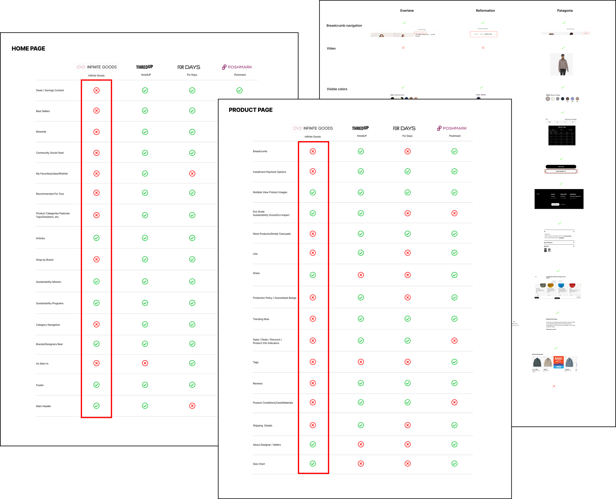
To ensure the site meets e-commerce industry standards, I conducted a competitive and comparative analysis using a feature inventory of leading sustainable e-commerce sites like Reformation, Everlane, Patagonia, and ThreadUp. The findings revealed opportunities to better position the site as a shopping destination for users.
AREAS OF IMPROVEMENT:
Lacks exposed categories and breadcrumb navigation
Missing detailed info and comprehensive filters
No user reviews or social sharing options
Missing pop-up savings, rewards, and sale indicators
USER INTERVIEW KEY TAKEAWAYSGathering User Insights
We conducted 14 interviews and usability tests to gain insights into customers' awareness of sustainable fashion and to identify the pain points in the user journey. We then analyzed the data and created affinity maps to find themes and patterns. Based on the users' responses, we distilled the findings into these key takeaways.
USER PERSONAUnderstanding the Audience
Before starting the design, understanding the audience is crucial. Our team developed Corrine, a user persona representing the ideal Infinite Goods customer: a style-forward, ethically-focused, progressive woman with a high income.
PROBLEM STATEMENT AND HOW MIGHT WEBuilding Empathy to Gain Users' Trust and Confidence
By identifying Corrine's needs and pain points, we crafted a strong problem statement using 'how might we' questions. This approach allows us to empathize with Corrine and develop innovative solutions tailored to her unique challenges.
Corinne, an environmentally conscious shopper, needs detailed and sufficient product information so that she can buy clothing aligned with her sustainability values.
How might we provide detailed product information on quality and fit?
How might we provide detailed sustainability information about the product?
How might we improve website navigation to make it more intuitive for users?
USER JOURNEYIdentifying Key Focus Areas in the Funnel
Based on user insights, I aimed to enhance user engagement by encouraging visitors to scroll and explore items, discover their ideal sustainable fashion, and ultimately increase sales.
IDEATION
Wireframing the Solutions
With the clearly defined problem, I started sketching out the solutions for improving the user experience. Then, I reviewed them with the team, and the selected solutions were transferred to mid-fi prototypes.
Enhanced Navigation
Exposed Shop Categories
for Intuitive Browsing
Optimized Shopping Experience
Enhanced Shop Features
Sustainability Integrated
Accessible Practices for Aligned Values
🔴 EXISTING DESIGN — GLOBAL NAV
Hidden Navigation: Buried Menu Items
Discovering shop categories tucked within three drawers under "Shop" lacks direct access, leading users to repeatedly navigate back, disrupting their experience.
Enhanced Navigation: Exposed Shop Categories for Intuitive Browsing
The updated global navigation, organized into two tiers with clear shop categories, simplifies product discovery, enhancing the user experience and boosting engagement and retention.
🟢 PROPOSED DESIGN — GLOBAL NAV
🟢
Exposed shop categories enable users to easily find products.
🟢
Notification banner display deals and promotions to entice users to shop.
🟢
Favorite icon allows users to save items for future purchases increasing retention.
🟢
Targeted 'Under 100' category directs users to the most viewed page.
Simplifying Product Discovery for Users
After implementing improvements, I ran a tree test on Optimal Workshop with nine new participants. The results highlighted issues with the old navigation, while the new design demonstrated improved efficiency and user-friendliness.
TREE TEST RESULTS
30%
Increase Overall Success Rate
🔴 Existing Design – Landing Page
Misaligned Shopping Experience
🔴
Oversize promo header exceeding the viewport discourages further scrolling.
🔴
Limited product images with similar styles suggest a small inventory, reducing engagement.
🔴
Mission values placed before products divert browsing.
🔴
Lack of product images on the bottom half of the page.
🟢 Proposed Design— Landing Page
Optimized Shopping Experience Enhanced Shop Features
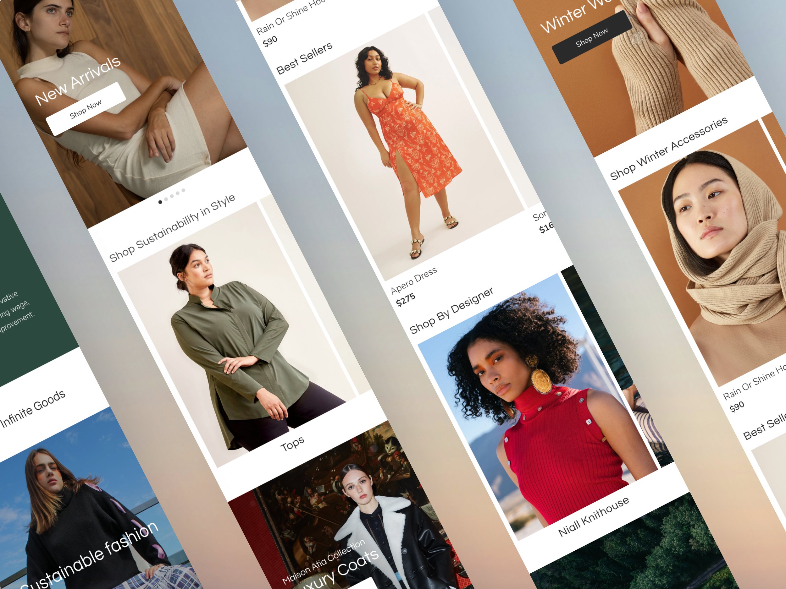
The enhanced design highlights shop features and sales, with sustainability messages strategically positioned below. Feature stories showcase multiview product images, encouraging users to scroll and discover.
🟢
Best sellers' product carousels highlight integrated recommendations to entice users to shop and increase sales.
🟢
Sustainability Score carousel to help users learn more about the company's sustainability initiatives.
🟢
Dynamic hero carousel displays bestsellers, trends, and sales to encourage shopping.
🟢
Shop-featured content highlights categories and new arrivals to entice users to shop.
🟢
Product images instead of icons to enhance appeal and boost sales.
🟢
Social shop feature allows shopping directly from social posts to build trust and engagement.
🔴 Existing Design — Landing Page
Insufficient Product Details
🔴
Purchasing details are separated by a lengthy description and Sustainability Score, disrupting the shopping user journey.
🔴
Missing shipping details, size guide, and color swatches dissuade users from purchasing.
🔴
Designer profile module uses space that could provide more product information.
Seamless Experience
Comprehensive Product Insights
for Confident Buying
🟢 Proposed Design— Landing Page
The new design incorporates comprehensive product details that instill confidence in purchasing decisions and provide a seamless experience.
🟢
Designer profile integrated into a product carousel module to encourage continued exploration.
🟢
Multi-view thumbnails are displayed above the fold, and larger image details can be scrolled, allowing users to see quality and fit more clearly.
🟢
Product details to help users make informed purchases:
Size Guide
Reviews
Color Swatches
Payment Options
Shipping + Returns
Care Instructions
🟢
Related content ‘You Might Like’ and ‘Best Sellers’ and recently viewed modules encourage continued shopping.
🔴 Existing Design— Landing Page
Unclear Sustainability Score Integration
🔴
Lack of clarity on the score reduces user confidence in sustainability practices.
🔴
Confusing tabs displayed as buttons in the Sustainability Score module overshadow the "Add to Cart" button located below, causing users to overlook it.
🔴
Sustainability Score module displayed above the purchasing details interrupts the shopping experience.
🟢 Proposed Design— Landing Page
Sustainability Seamlessly Integrated Accessible Practices for Aligned Values
The streamlined sustainability score integration offers easy access, providing clarity and guiding users through the score without disrupting the shopping experience.
🟢
Descriptive title provides clarity to the Sustainability Score grade.
🟢
Located in the product detail module provides easy access to Sustainability Score info without interrupting shopping.
🟢
An info icon clicks to a pop-up window and lets users read about metrics without leaving the page.
🟢
Learn More’ link directs users to the Sustainability Score guide.
RESPONSIVE DESIGN
Enhancing Accessibility across all Devices
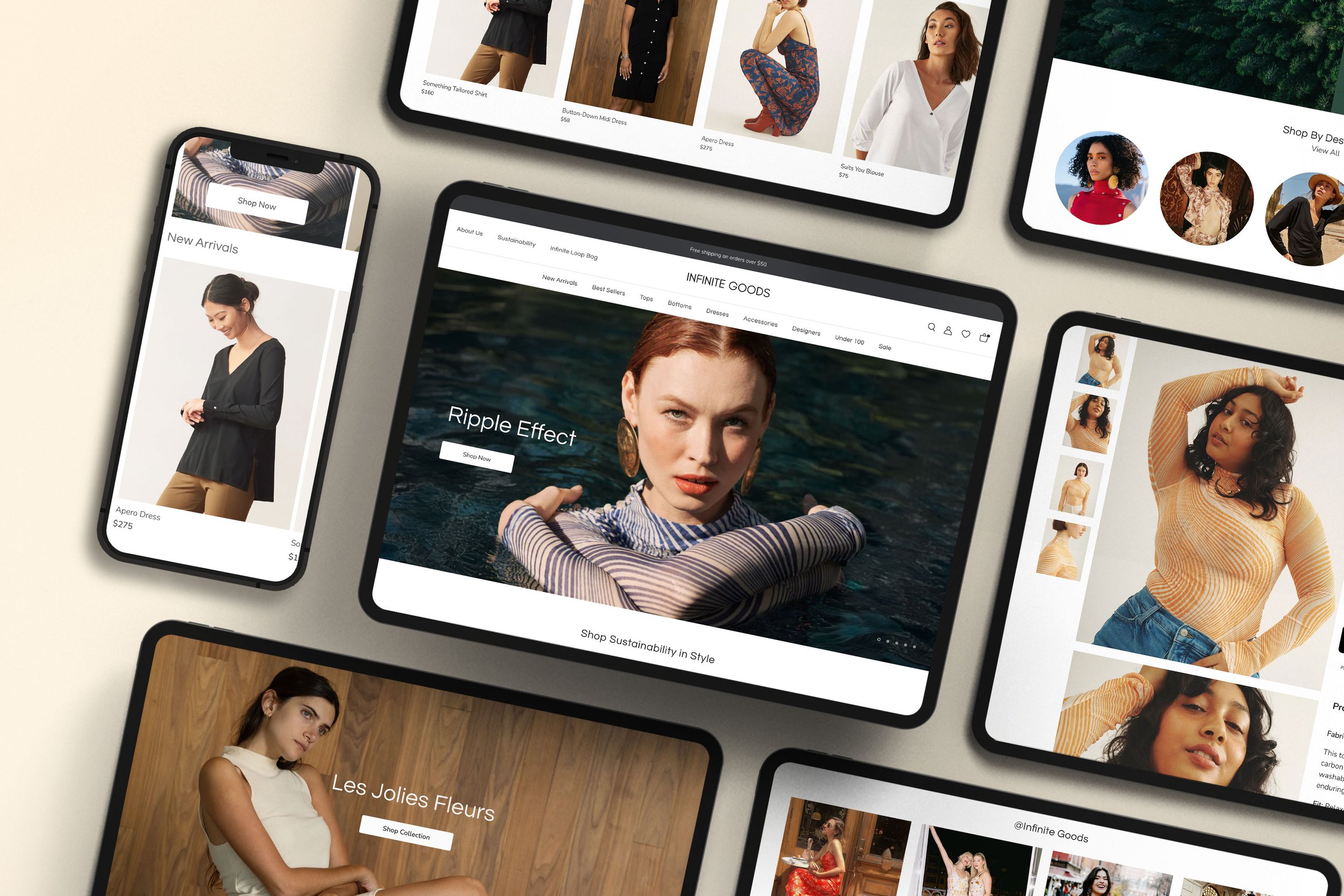
Our research revealed that more than half of our users shop on mobile phones. In response, I developed a responsive site to ensure a seamless shopping experience across all devices.

DESIGN SYSTEM
Developing a Scalable, Modern Minimalist Design System
I kept the site's clean, minimal aesthetic that users favored. Recognizing Infinite Goods' rebranding efforts, I made minor adjustments to the design system to better highlight their diverse product range and commitment to sustainability. This included simplifying the logo, updating buttons and icons, and refining the color palette to a more neutral tone that accentuates the product variety.
USABILITY TEST RESULTS
Usability Test Results
We tested our high-fidelity prototype with 20 users via Maze to gather feedback.Users rated the ease of purchasing a tank top at 9.8/10 and the site's aesthetics at 9.4/10. The sustainability score comprehension, however, received a 7.4/10, highlighting an area for improvement. Overall, the feedback on the website was very positive.
In your own words, what sets Infinite Goods apart from other e-commerce retailers?
Clear purpose
of sustainability

“The team did an incredible job. They went above and beyond in the number of things they’ve added to the project that weren’t even in the scope, like mobile iteration. Everything will be so useful and implemented by our team, and I’m already obsessed with the high fidelity they’ve put together. And I didn’t even realize we had such powerful imagery throughout our products.”
CLIENT FEEDBACK
–Aileen Lee, Founder
Reflections
Earning Trust
My research shows that users prioritized seeing how clothes fit and having clear information over sustainable materials. I learned that a successful e-commerce platform builds consumer trust and confidence.
Guided by Data
When working with a team and assessing multiple solutions, I recognized the importance of revisiting the data and prioritizing user needs to determine the final design solutions.
Enhancing Product Visibility
During my research, I found numerous designer collaborations and striking editorial photography. By featuring these on the homepage, I added vibrancy and engagement for shoppers, enhancing the overall user experience.
NEXT STEPS
Our team had a 3-week project time constraint, so we submitted a priority list to the client for immediate attention. However, we would like to further explore the following items:
• Reimagining the explanation of the Sustainability Score
• Establishing a ‘Certified Infinite Goods’ badge for brand recognition
• Monitoring the conversion rates to track improvements
• Incorporating social sharing features to encourage designers and consumers to build a more sustainable world.
Next Project


